Want something to freshen up your space? These custom down-filled geometric pillows are it! They are $50 for the pair. I just whipped them out today:) Comment if you are interested.
Monday, May 20, 2013
Monday, March 11, 2013
New Venture
Check out our new blog for our latest design posts: www.triodesignteam.blogspot.com
Saturday, December 29, 2012
Making an Office Space Sing
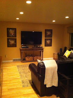
So one of our favorite client's Breanna, asked us to decorate their second audiologist office. This is what we had to work with. They wanted to use these leather sofas but have it feel fresh and modern.
It was just your basic strip mall space, but with a little decorating magic
this is what they have now! We found great modern pillows from Ikea and went that direction. We used botanical and nature prints as artwork for the wall, our favorite Ikea lamps, accessories from Osmond and Rod Works, and furniture from World Market.
We loved this storage solution for their office area as it is functional and beautiful.
To tie the accessories back to the audiologist specialty, we looked for objects that could represent hearing. Thus, the phone and the bass cleff print.
I found black and white diagrams of the ear online and framed them in the Ikea Virseum frames for the perfect artwork for the space. It was an amazing transformation!
Labels:
Office Space
Jeni's Kitchen
For the past two months we've been working on Jeni's kitchen remodel. Here are the before pictures. They wanted to completely redo the kitchen from refacing the cabinets, to adding a backsplash, to a new countertop treatment, new table, chairs, stools, etc. It was quite a dramatic before and after.
Here's the final product! Isn't it fabulous. It feels so fresh and new.
Jeni loves color so we added lots of pops of it throughout the space. I love the new window treatment I made for above the sink.
New accessories on the cupboards made a big difference.
I love this grouping of colored doors. I found all of the pictures online and then framed them in the Ikea Vireseum frames. A great inexpensive impactful option for artwork.
Of course we added a tray to her new table. I found the table on ksl.com for $75. It is a Duncan Phyfe antique that can stretch to 11ft, one of Jeni's needs. We also added colored chairs from Forget me Not as her dining chairs.
New window treatments for the bay window brightened up the dining space as did the lighter color on the walls.
Here's the grouping above her new hutch.
This was another little creation of mine. I had picked up this frame from Forget me Not a couple months back. I framed it around this key ring from Hobby Lobby to elevate it up a notch.
This was a great kitchen makeover with fun color and elements we hadn't used before!
Labels:
Kitchen
Vicki's Christmas Tree
It was so fun to do Vicki's Christmas tree this year. It turned out beautiful, and she loved it.
Lindsay is amazing when it comes to decorating trees! We used some of Vicki's ornaments, and then added picks, additional ornaments, santas, signs, etc. The trick to a good tree is layering with lots of different textures, shapes, etc.
Labels:
Christmas decor
Vicki's Upstairs
It was amazing to see the difference adding a new rug, artwork, window treatment, accessories, pillows, etc had in Vicki's upstairs. The yellow and gray really warmed the space and tied in beautifully with the brick blackspash in the adjoining kitchen.
Labels:
Family Rooms
Vicki's Bedrooms
Vicki's husband brought this bed home from Korea years ago. She wanted to make it work along with a old fashioned feel with her grandmother's quilt. Although it was a bit daunting at first, it all came together so nicely and is one of my favorite rooms.
We added simple linen window treatments, new bedding and throw pillows. The antique quilt is overlayed at the foot of the bed. The bedside tables and lamps were perfect as were the collection of accessories we found.
This floral print was a gem from Ikea.
I simply framed a piece of the pillow fabric for the frame insert.
The floating collage wall frame gallery was the perfect statement for this room. It really turned out amazing.
This room was quite dark and cluttered with furniture. By changing the window treatments, adding new bedding, artwork, accessories, and rearranging the furniture, it has a whole new life.
I made a simple chevron bedskirt for the crib to tie it into the rest of the bedding. Now it is the perfect guest room for her children and grandbabies.
Labels:
Bedrooms
Subscribe to:
Comments (Atom)


