Thursday, May 31, 2012

Kelly's New Room


Kelly's bedroom was in need of an update from the paint on the walls to the bedding.


She wanted a yellow and gray room. It was just what I've been dying to design. We started first with new bedding. We found hers here at Target. It was the perfect subtle pattern of gray and white. I had her get a darker gray bedskirt and Euro shams to accent the bedding. Next, we looked on Fabric.com and found the perfect accent fabric here. The other fabric is sold out, but was my favorite accent in the room.  (The wall paint color is Dolphin Fin from the Behr Ultra Home Depot line.) 


I got the rug and lamps at Ikea for $20 each. They were perfect for the room. The lampshade had a basketweave texture that added another layer to the room. I made her new drapes for the bay window and custom frames for the frame wall.


I've been wanting to do a gallery wall in a bedroom but wanted to add more than just pictures.  I fabric backed the frames and mounted Kelly and Mat's initials.  Then we picked six of her favorite couple photos and framed them in the Ikea Ribba silver frames.  ($9.99 each)  In the center, I found this awesome canvas of a tree with a aqua bird.  I loved the pop of color and added the & sign and the "Love" sign to finish off the idea of the room being a couple's retreat room.  It was so much fun to work with Kelly and do this for her.  I hope she enjoys her new retreat.

Tuesday, May 29, 2012

From Red to Blue


It was so much fun to redo Kelly's front room. For years, she had a deep red wall. As she was over the red phase, it was time for a change.


  Enter the blue, green motif I envisioned with a little help from my Ballard Design catalog.  We loved this deep blue color for her walls.  It is Planetarium from Home Depot's Behr Ultra Paint line.  Don't you love the contrast?  I loved this artwork from Hobby Lobby.  We paid $50 for it.  Unbelievable price for such a great piece.  I paired it with my favorite sunburst mirror and the custom music pages art piece from the last post.  In order to keep the room from feeling too cold, I warmed it with the oil rubbed bronze, brass and wood accents.


I loved the simple accents we used.  Kelly teaches piano, so she didn't want a lot on the piano.  The pitcher is the perfect place to store pencils for her students.  She already had the cute birds, and they make a nice grouping with the wooden metronome.


I love the simple tray of balls on the other side of the piano.


This wall became such a great focal point as soon as you walk through the door.


We looked everywhere for the perfect pedestal table for beside the couch.  All the ones we found were too high.  Kelly found this gem in her sister's basement.  It was oak, so I painted it cream and gave it a new life.  Isn't it perfect?  I love the new lamp paired with the accessories.  The two old books were the perfect blue and green for the room.


I love the fabric for the two pillows.  The embroidered pillow came from Target.  The patterned fabric was from Hobby Lobby and was the perfect shade of green to add to the room.


For her entry, Kelly bought a new cabinet from Hobby Lobby.  She had all of the accessories except the greenery and the stone artichoke.  I just grouped them in a different way to make it balanced and work with scale and proportion.


We moved her family picture and Proclamation onto this wall by the temple to make a grouping.


This little thought in the corner is one of my favorites.  I love the little pop of green in the topiary mixed with the dark wood of the vase and the gold of the clock.  Don't be afraid to mix colors and finishes.  As you can see, it works. 

The fabric for Kelly's curtains was my favorite statement in the room.  It looked so rich and added such warmth to the space.  I love the geometric print.  They were just what that room needed and tied everything, including the new rug, together!


Check back this week for Kelly's bedroom reveal!

Saturday, May 26, 2012

Hitting the Right Note


I am decorating a room for my neighbor Kelly.  It is her front room/piano room.  We needed a third piece of artwork for a wall grouping.  As I've framed book pages before, this time I thought of framing music pages.  I headed to Forget Me Not, and found the perfect music theory book. 


I cut foam board to size and layered the music pages until I was pleased with how it looked. 


I placed it inside an open back frame from Hobby Lobby. I used glazier points to hold the board in the frame. This is a super easy project and the perfect piece of art! Can't wait to show you the finished room!

Monday, May 14, 2012

Adding meaning to a wall


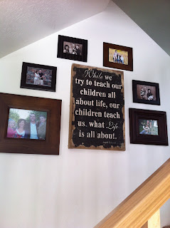
I found this darling sign at Rod Works last weekend.  It spoke right to what I needed to hear as I've been struggling as a mommy.

The perfect spot for it was the center of my picture wall.  Thanks Kallee and Lindsay for the placement idea.  I absolutely love what it says and how it ties the pictures together.  Happy Mother's Day!

Friday, May 11, 2012

Upon a Shelf

I've been wanting to redo the wall space by my family room window for a while now.  I wanted to somehow incorporate some book shelves decorated with pretty things.  I've been collecting fun accessories for the past few months and was just saving money to buy the shelves.  Thanks to Kristin's "thank you for redoing my front room and kitchen" gift card to Ikea, I was able to go get them.  The shelves are super inexpensive at $15 for the 43" width and $7 for the 11".  Here is the finished product!


I love the big letter "M" from Hobby Lobby.  I layered it with a print from Ikea that I've had in my front closet for the past two years.  I found the bookends at TaiPan.  They were $30.  (Restoration Hardware had the same ones for $70.)  I picked books from my bookshelf that would compliment the color scheme in the room.  I added the ball and the green bunch for color and texture.  I bought an old book, ripped out a chunk of pages, rolled and tied them with jute for added interest.  I love this shelf.  It is just what I have wanted in that space.


On the other side, I added two of the shorter shelves.  I got the @ sign and artichoke from TaiPan.  Again, I placed books that worked with the colors.  I found the cute sign at Rod Works and the darling frame at Forget Me Not.  I ripped up book pages and layered them together to create the inside of the frame.  I LOVE MY WALL!  It makes me so happy when I walk through the door!

Wednesday, May 9, 2012

Adding to

I've had this beautiful picture of the Savior in my home for years.  This past week, I found some great things to add around it.  Seagull Book had the Living Christ and The Proclamation on sale for $20.  The frames coordinated perfectly with the frame from the pic of the Savior.  I loved the numbers from Pottery Barn and wanted to use them in my home.  In order to balance the numbers, I matted and framed the quote "Journey to Higher Ground."  It was a talk given by Joseph B. Wirthlin a few years back.  I loved it and wanted it to be our family motto.  Now it is incorporated in the right room next to the right inspiration.  This room has always been my sanctuary, and even is more now!

Monday, May 7, 2012

Kristin's Front Room Makeover


Kristin's front room felt very dark.  She has orange couches that we couldn't change.  So, I brought in light fabrics to bring a whole new feeling to the room.  I found this fabric for her curtains again at fabric.com.  It was $9.99/yd.  As we needed to make 2-109" curtain panels, we found a bargain and only spent $65 for this fabric. 


The curtains added such light and airyness to the room.  Kristin wasn't quite sure about the fabric but trusted me.  She loved how they turned out!


 I picked these two fabrics to coordinate with our window fabric.  The floral had the perfect touch of orange as to not ignore the couches, but had such a lightness with the mixture of other colors.  I love the green geometric.  Don't be afraid to mix patterns.


I love the piano accessories.  It was such a difference from before. We brought in the green and turquoise from the kitchen colors to tie the two rooms together.


We found some great orange accessories, like this pitcher.


We rearranged her existing artwork and added a few framed quotes to balance out her picture wall.  She already had the frames, and so it cost absolutely nothing!  Love it when that happens.


Lastly, we created this little tray for the front room table.  I love the clock with the pop of turquoise.  Her front room is now bright and cheery.  As Nate Berkus says, "It rises up to meet her" when she walks in the door. 

I would love to help anyone redo a space, especially if you would like to change the fabric scheme.  We spent $100 from fabric.com and made custom drapes and 8 throw pillows.  It can be done, and I will help you from picking your fabric scheme to sewing.  I charge $20/hour for sewing, and had Kristin's project done in 3 hours.

Thursday, May 3, 2012

Kristin's Kitchen Redo


My cute friend Kristin wanted my help to redo the accessories in her kitchen.  She had these silver platters that she still wanted to incorporate.  We headed to TaiPan and found some great accessories to add some color and variety.


They made such a big difference.


I love the touch of green and the pop of turquoise.  The print with the eggs was the perfect addition of artwork.  Use artwork anywhere.


Kristin loved how it turned out, and I am so glad.  Adding just a few accessories and bringing in some color was just what it needed.


We also did this cute tray for her dining table.

Fabric.com has the best fabric selection.  This material was the perfect choice for her window curtain.  I love it!  The turquoise is again the pop of color the kitchen needed.  I'll post more pictures once she gets her cabinet next to the window hung.  Check back in a few days for her front room redo!